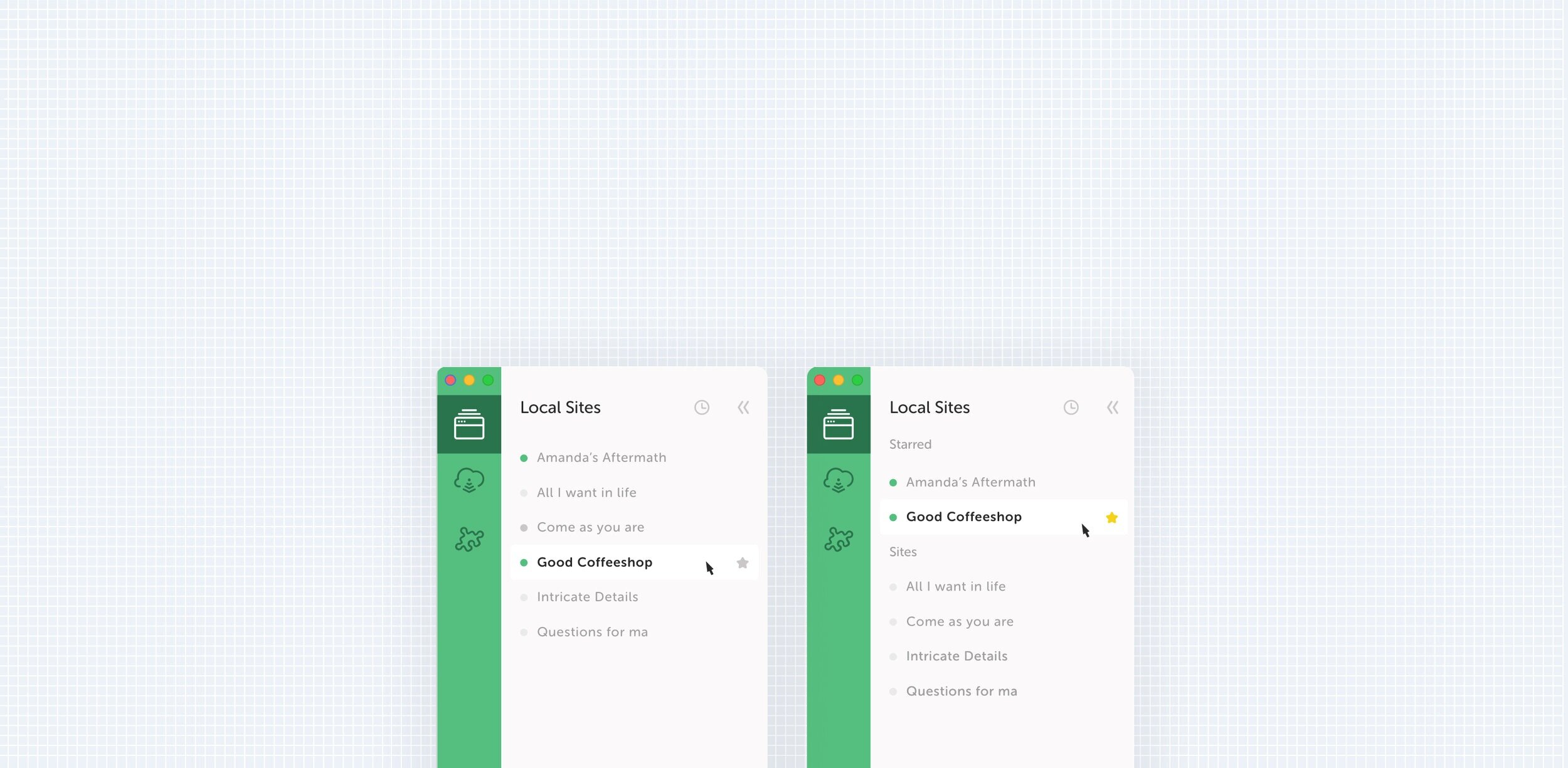
Sites Organization
Effortlessly access your sites for a streamlined workflow.
Local
Sites Organization
GOAL
User: Access sites quickly for a better workflow
Business: Increase connect adoption
Product: Improve the foundation of the app to build better features.
MY ROLE
I was the main designer working on this project with a team of 1 product manager and 3 engineers. I created workflows, prototypes, conducted usability tests.
Context
MAIN WORKFLOW
Local has simplified the process of spinning up a new wordpress site. A workflow that used to take a few hours now takes just a few minutes with Local. Users create, develop, and deploy wordpress sites all from the desktop app.
CUSTOMERS
Local’s customers fall into a wide spectrum with users just starting to learn development, to developers working full-time and using Local with their teams.
This is what Local Local looks like
Problem
Customer Feedback
Grouping sites into folders is the #2 most requested feature in Canny. I’ve had customers request for better organization of sites in the app.
UX PROBLEMS
A future problem we want to solve involves a solution that requires knowing which sites are being used frequently. Solving for this customer painpoint creates a better foundation for solving other problems.
Customer Calls
I began research by reaching out to active Local customers. I spoke with 10 customers that had been using Local for 6 months or more, they had at least 14 sites in their sites bar.
The goal of the call was to understand their overall workflow and how they used the sites bar. I wanted to understand what they did before starting a site — was starting a site the main motive? What happened at the end of their workflow, did they turn sites off? What did they do before leaving the application. I also wanted to dig into how they named sites and if or when they deleted sites.
A slack screen shot of the research results
Ideation
I took the feedback from customer calls and organized our user needs into two main themes. Users desired a way to organize sites that they were not actively working on, and users wanted to access the sites they were working on quickly.
Active Sites: I need to quickly access the sites that are currently in priority
“I’m usually working on 1 to 3 sites at a time.”
“The sites bar isn’t a painpoint, but better organization would help with distractions.”
Inactive Sites: I have a lot of sites that I’m not actively working on, but can’t delete.
“I don’t delete sites often in case I hear back from a client.”
“Sometimes I’ll have multiple sites per client or project”.
“I have sites for my job as well as Freelance work”.
Concepts
Pinning Sites
How might customers react to pinning/starring the most important sites to them and accessing them at the top?
Folders
How might customers use an and archived folder?
Testing
I designed 2 concepts and tested them with 5 users. I was able to test with 3 customers from the beginning of my research, and I found 2 internal users that used local for freelance work.
A video walkthrough I made to share out with my team to get feedback on the concepts I was planning to test.
What I learned
Both concepts performed well. Pinning sites was easily understood. One action limited users from over-organizing. With the exception of once user, all users said that they preferred to have the larger feature set that came with creating folders over the ability to star sites. I also was receiving feedback from the team that folders were the way to go.
But I wasn’t convinced.
Why do users prefer folders over starring sites?
From a usability perspective folders are great. They are a commonly understood paradigm in software. Folders are also complex. They are made up of a handful of different micro interactions. They give people a lot of flexibility, but is flexibility what our users actually need?
Reframing the problem
As a team, we first approached this problem with the goal of helping users better organize their sites. But through the research, I realized that if we created a great organizational structure would that actually help customers get to work faster, or would we be creating a structure that might actually require users to put energy in maintaining.
Solution
I proposed 2 solutions. Both bodies of work were independent from each other, allowing our team to deliver incremental value. Both concepts deliver quick interactions that allow users to actively find work sites and start developing.
Starring sites
Allows customers to quickly prioritize sites without even thinking about it.
Sorting sites by most recent
With a click of a button, view your most recently active sites first.
Getting Buy-in and Story Writing
I walked my team through the process that I took to get to the solution. Sharing customer insights, and breaking down the problem. From there, the developers on my team were able to break down the design and look it it from an engineering perspective. This was also, a great way to get the team excited about this work.
Here’s a screenshot of my team session as we worked through technical implications.
Next Steps
Iterative Approach
Testing outcomes with real users, and getting feedback
Maybe Folders?
What we learn from the current solutions could inform what we build next.
Future Thinking
One of the exercises I push myself to do is to always think about how the solutions we deliver today could expand in the future. I like to think about the future of the UI. How continuing to evolve the UI and design system will solve for problems we’ll face as we continue to expand the product.
There could be a future where users to feel informed about the state of their sites in the side bar.
The screen shots shows how the components in our sidebar could evolve, supporting dark mode, and new icons that help use the space economically.


